

An ongoing branding challenge.
The client.
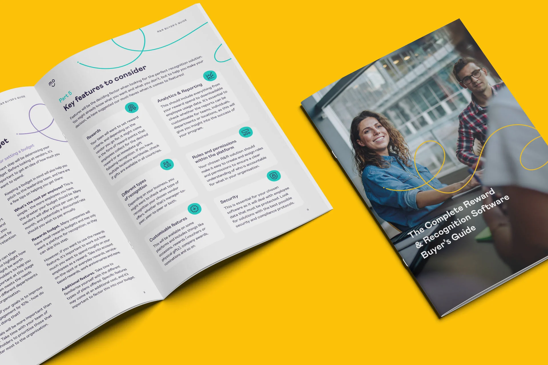
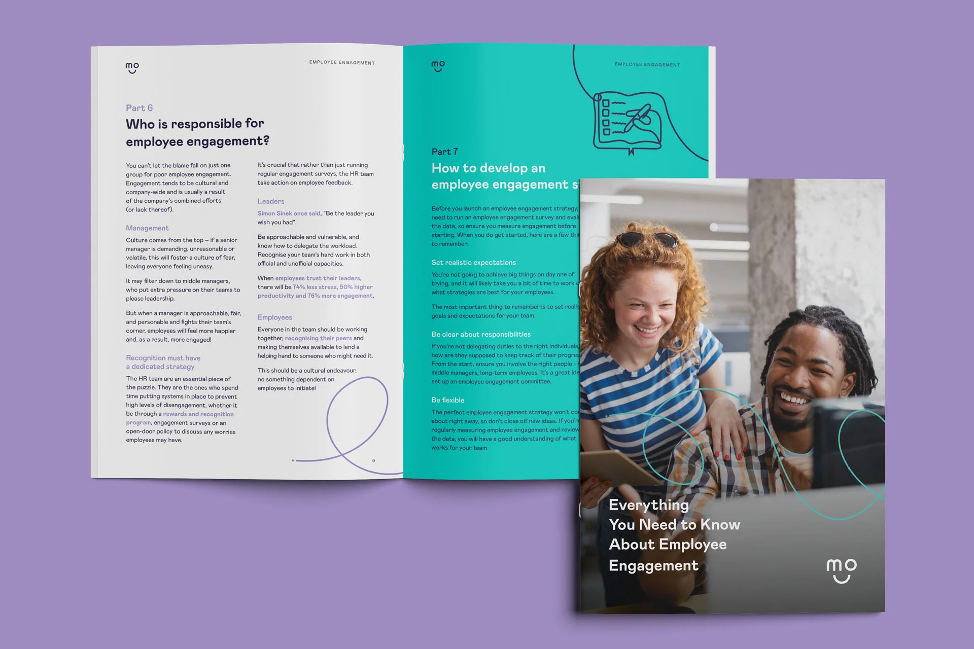
Mo is an employee recognition and engagement platform. A tool for managers to improve collaboration and performance, motivate and reward their teams. The business has experienced significant growth over recent years, tens of thousands of people log in to Mo everyday and it is now relied on by the likes of the NHS, William Hill and OVO Energy to help foster cultures where employees feel valued.
The brief.
1. Evolve the brand the business launched with to represent the Mo of today. Where the business has expanded with purpose the brand now lacked clarity and consistency with no clear direction.
2. Manage the evolution real time on live briefs and continue into ongoing day to day production and brand guardianship across all Mo communication and collateral.
The solution.
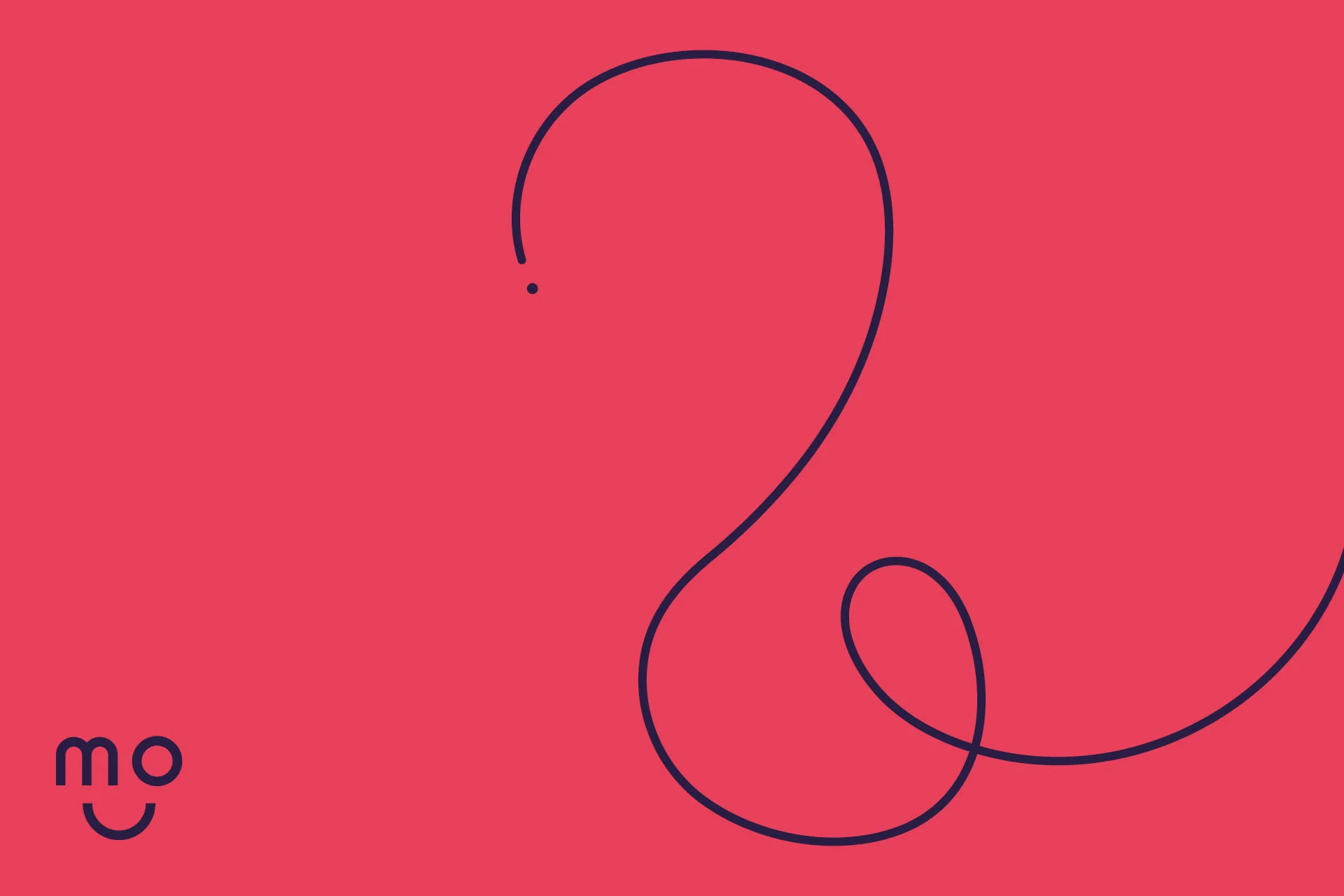
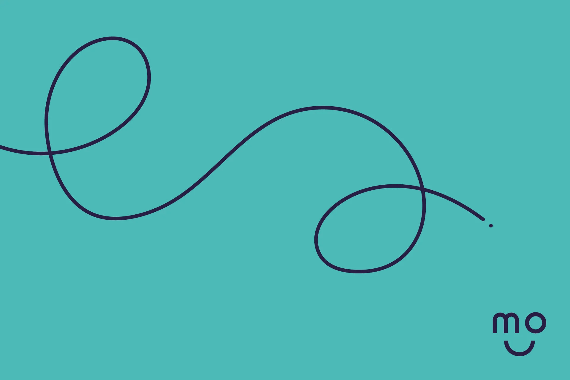
The Mo brand wasn’t broken, it just needed some reorganisation, focus and discipline. We opted to retain and focus on the core colourways which were working well for Mo, secondary colours and tints were removed. We introduced further visual consistency through imagery and the use of the geometric shapes from their logo suite. This all gave the brand a clear and impactful identity and some very clear rules and guidelines for the future.
Deliverables.
Brand guidelines | sales presentation decks and templates | social media content | info graphics | online brochures | user guides