Putting a ‘f’ for ‘food’ into a new kitchen and deli.
The Client.
Fork, a new start up baked in Suffolk was just that, starting from a blank piece of paper. Its founders have extensive experience in the hospitality industry so knew what they were doing with their new contemporary deli business with delicious food to eat in to take away.
The Brief.
Create a brand identity that is contemporary – clean and modern. It needed to be responsive to work across large format signage, social media channels, event marketing and product packaging. All within a limited ‘start-up’ budget!
The Solution.
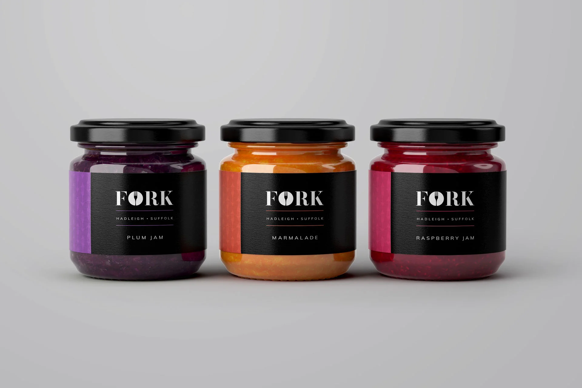
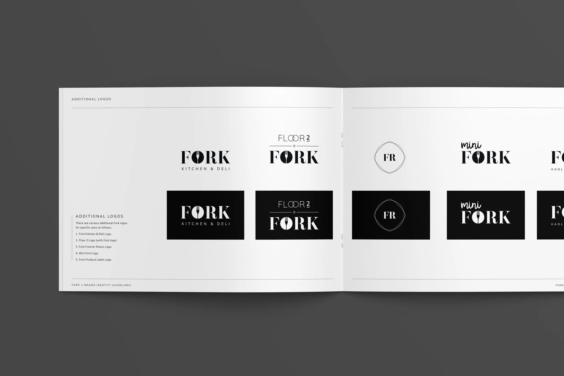
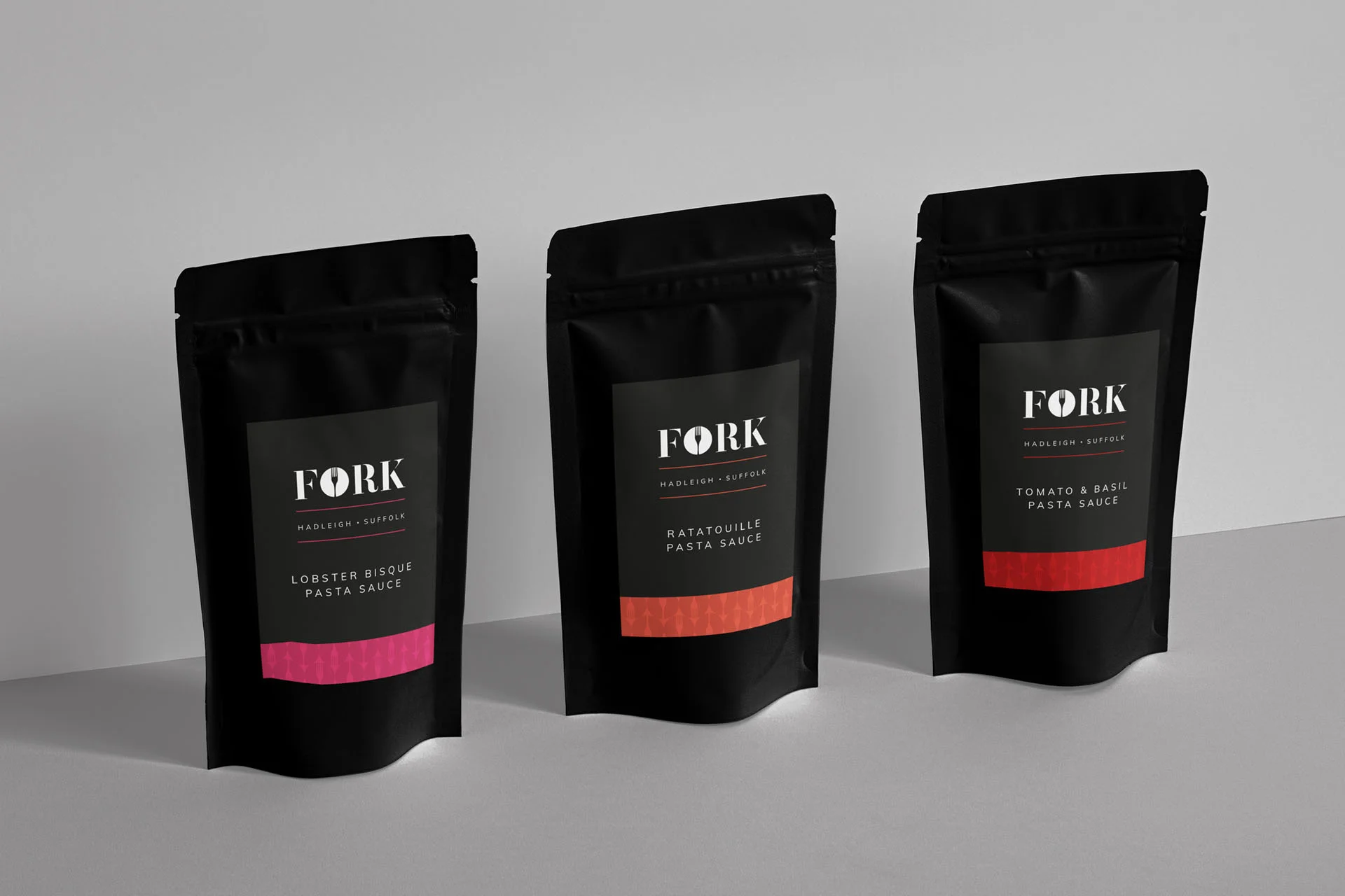
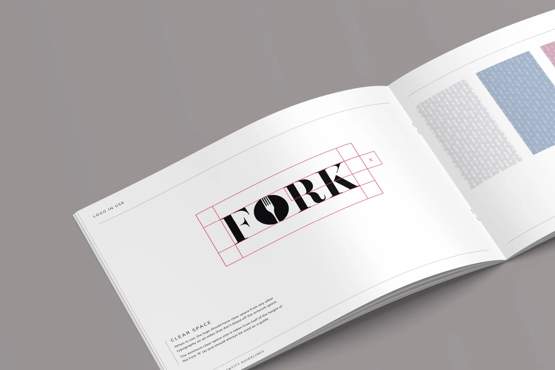
In order to stand out in a busy high street it was important to create a high impact design that worked consistently instore and across all communications. We chose classic black and white, with the addition of 14 secondary colours that are used to colour code product ranges. The ‘O’ in Fork was designed to be an easily recognisable icon which we used a repeating pattern in the background to add texture and depth.
We also created sub brands to work independently or alongside the Fork hero product family for the ‘Mini Fork’ range (for children), and the ‘Bake at Home’ range.
Deliverables.
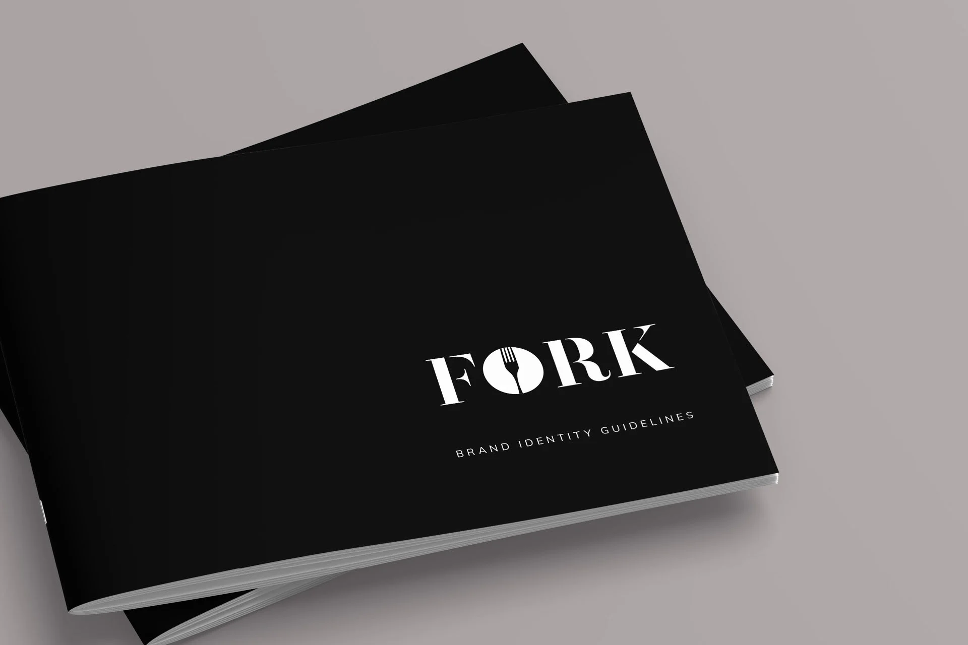
Logo & brand identity | Brand guidelines | over 80 Product labels